


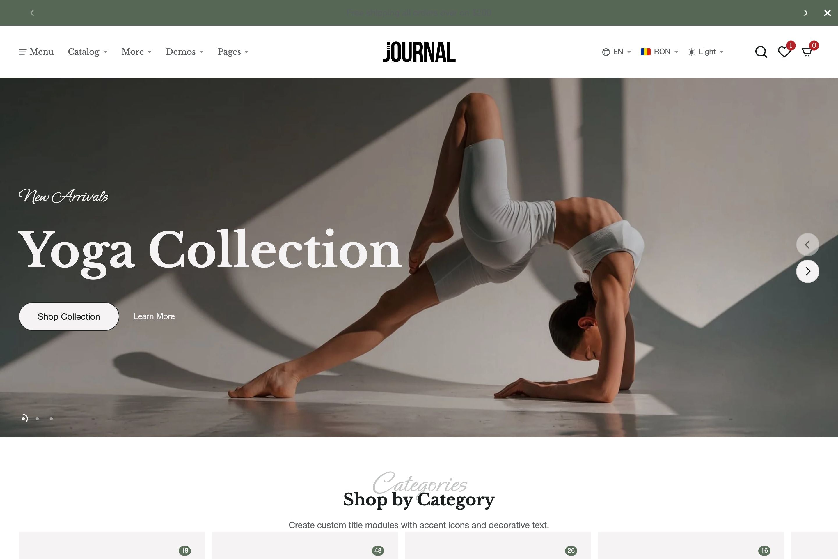
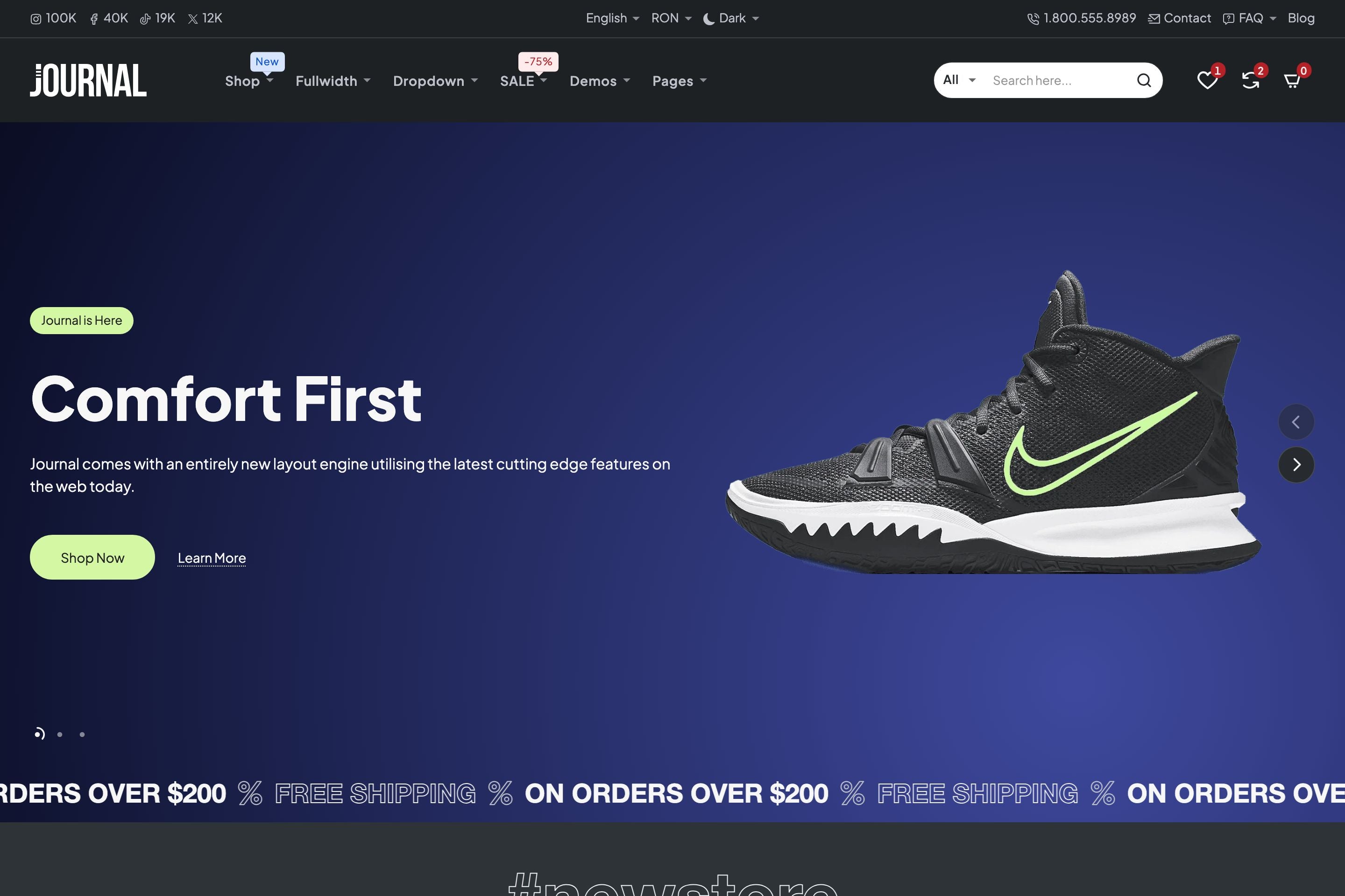
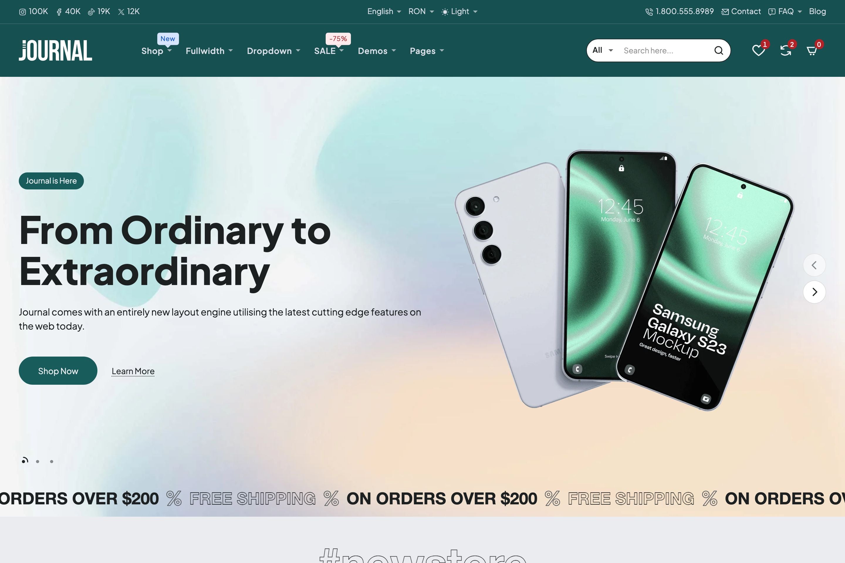
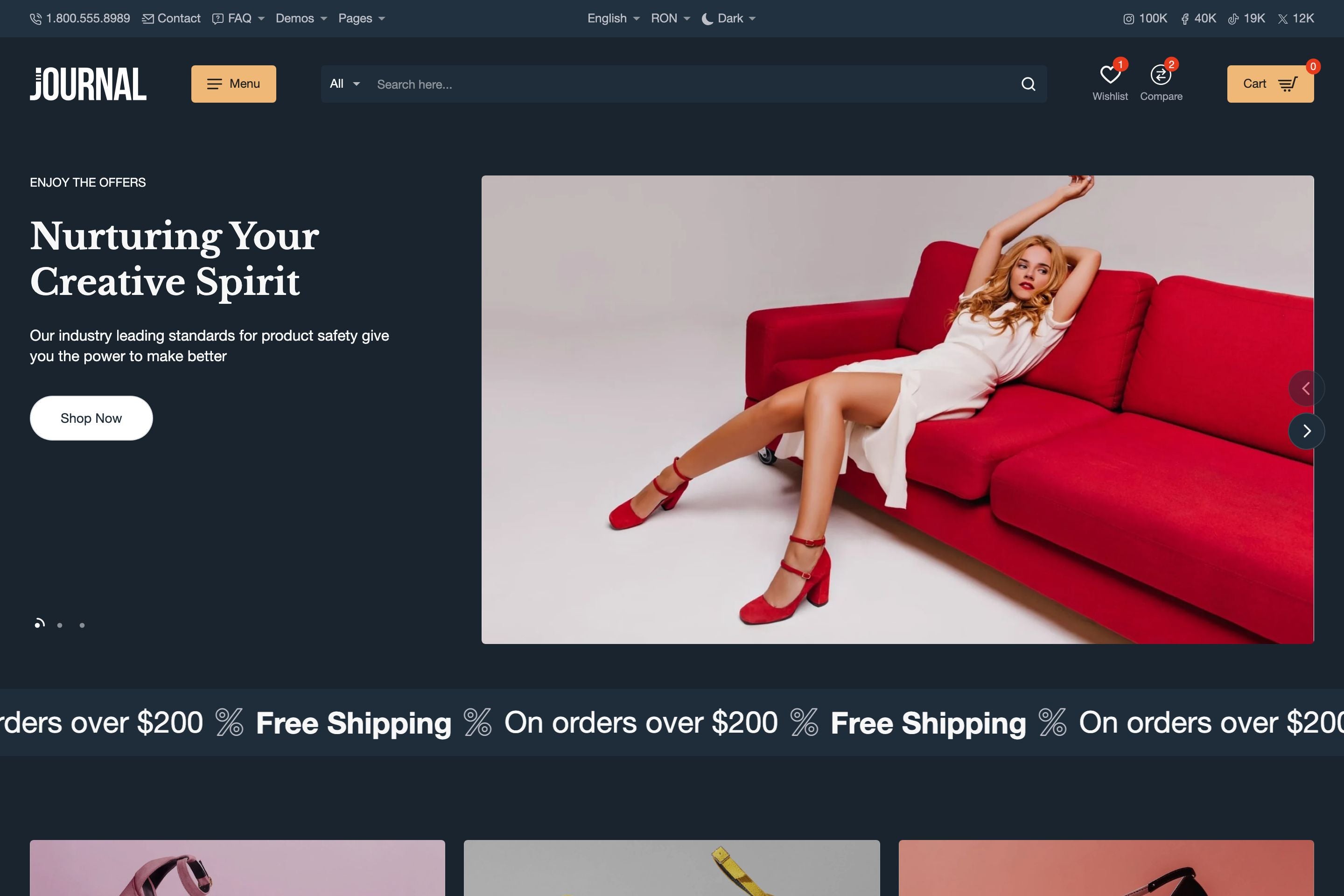
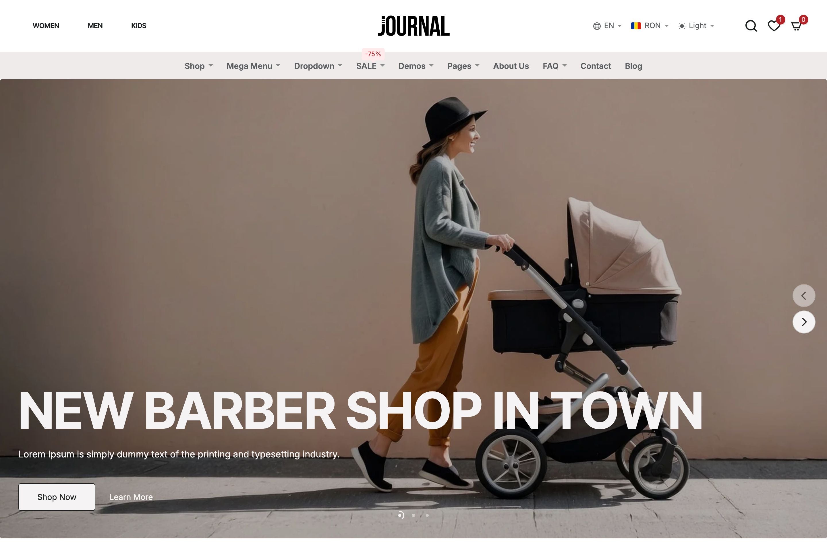
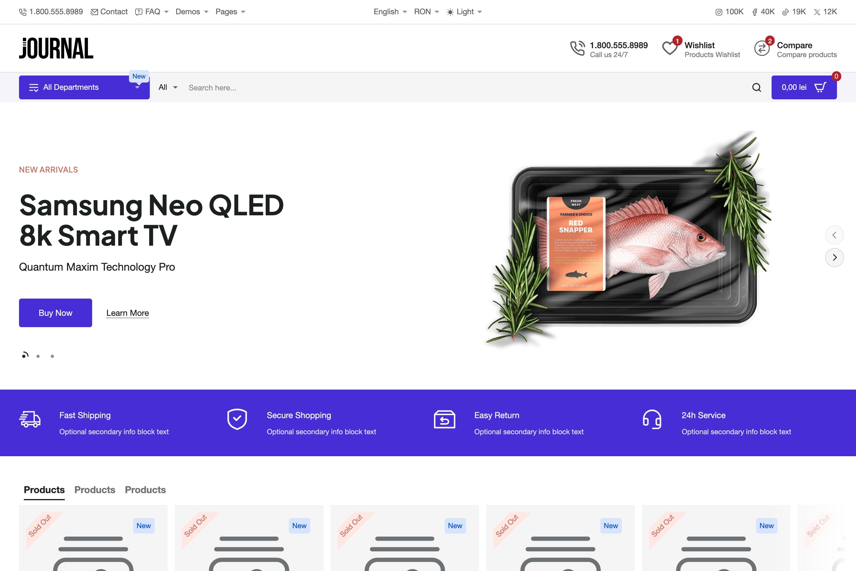
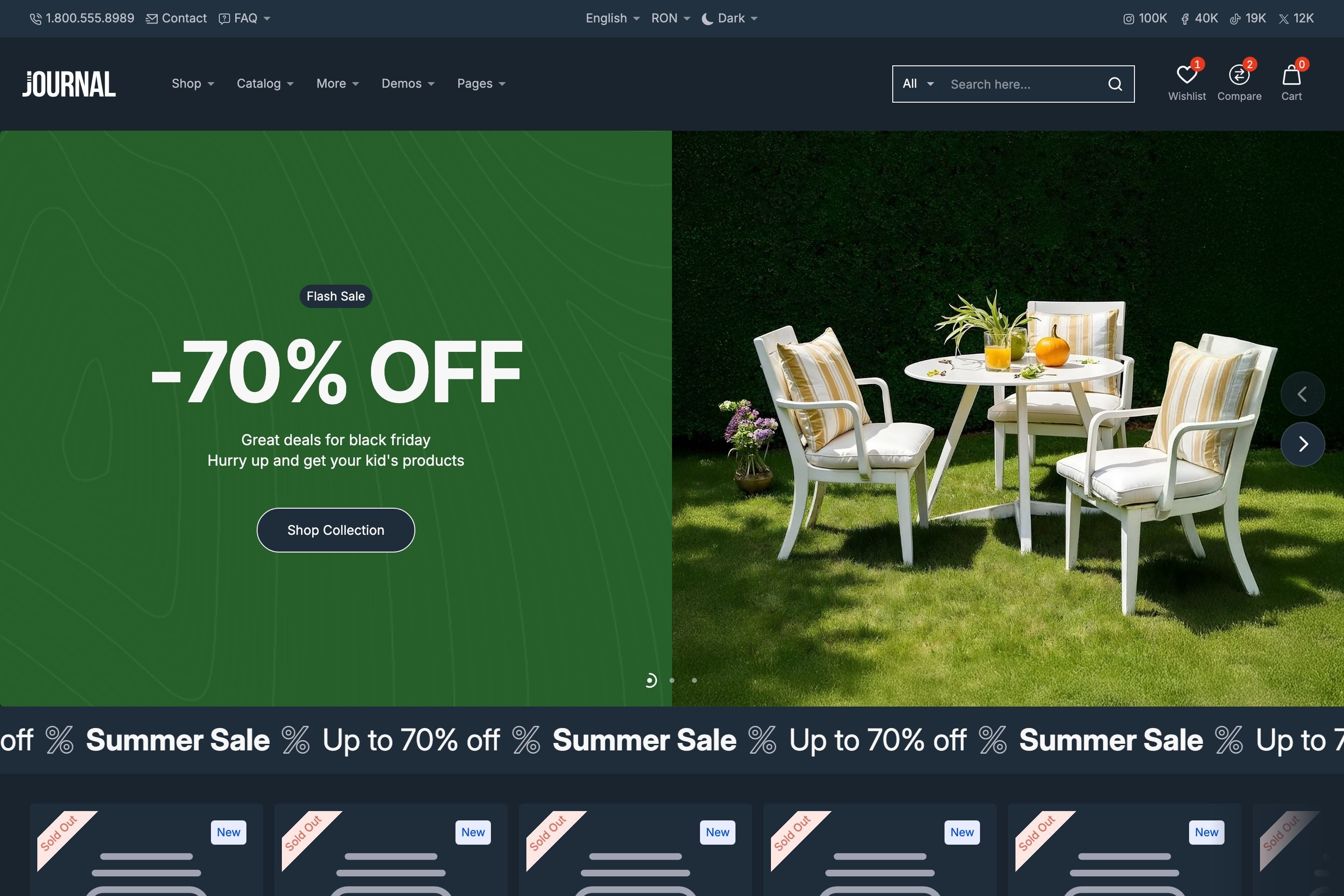
Headers and navigation can often feel restrictive in Shopify themes. With Journal, we’ve reimagined the process by introducing a true header builder and advanced menu systems that give you unmatched flexibility.
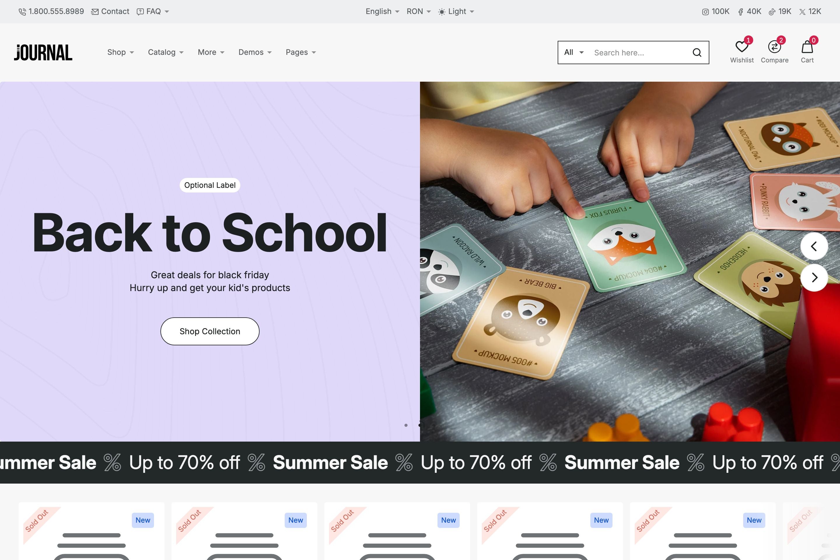
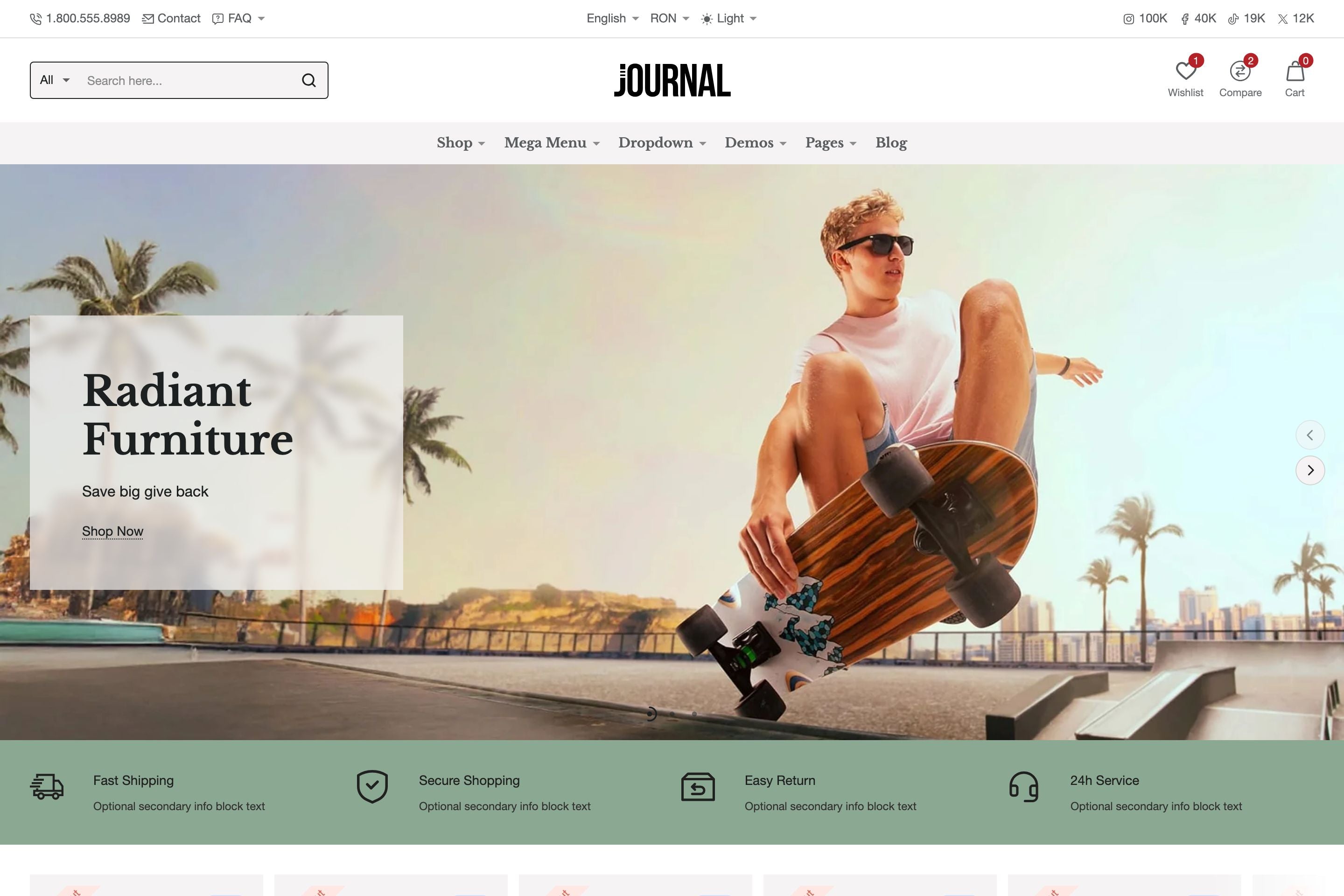
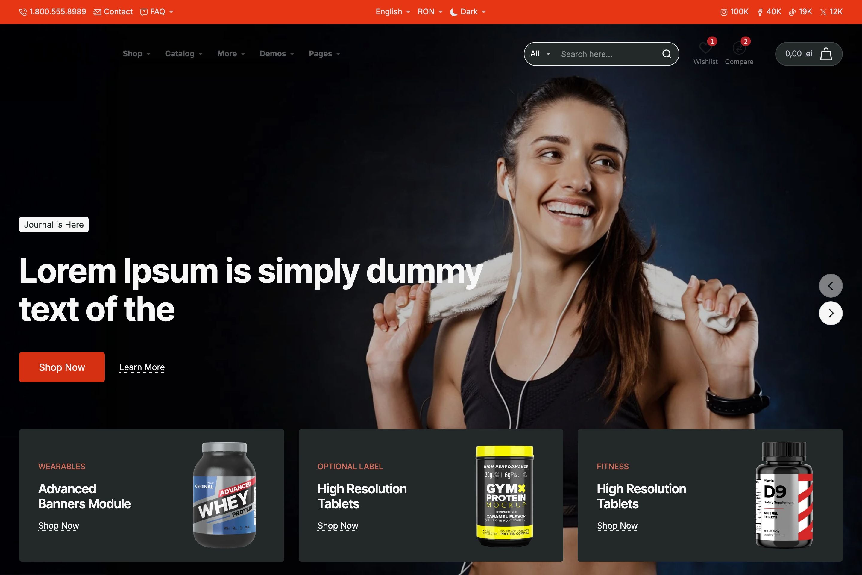
Header Builder: Sections & Blocks
The Journal header is built using a section and block system, a novel approach that covers the most use cases.
- Each section includes three alignment positions: Start, Middle, End.
- Each position accepts unlimited header blocks.
- Add as many sections as needed to create anything from a minimalist single-row header to complex, multi-layered structures.
- Load any pre-designed header structures from our demos - all headers from all demos are available as presets.
This modular approach allows Shopify merchants, developers and designers to build their own unique header variations beyond our demo offerings.
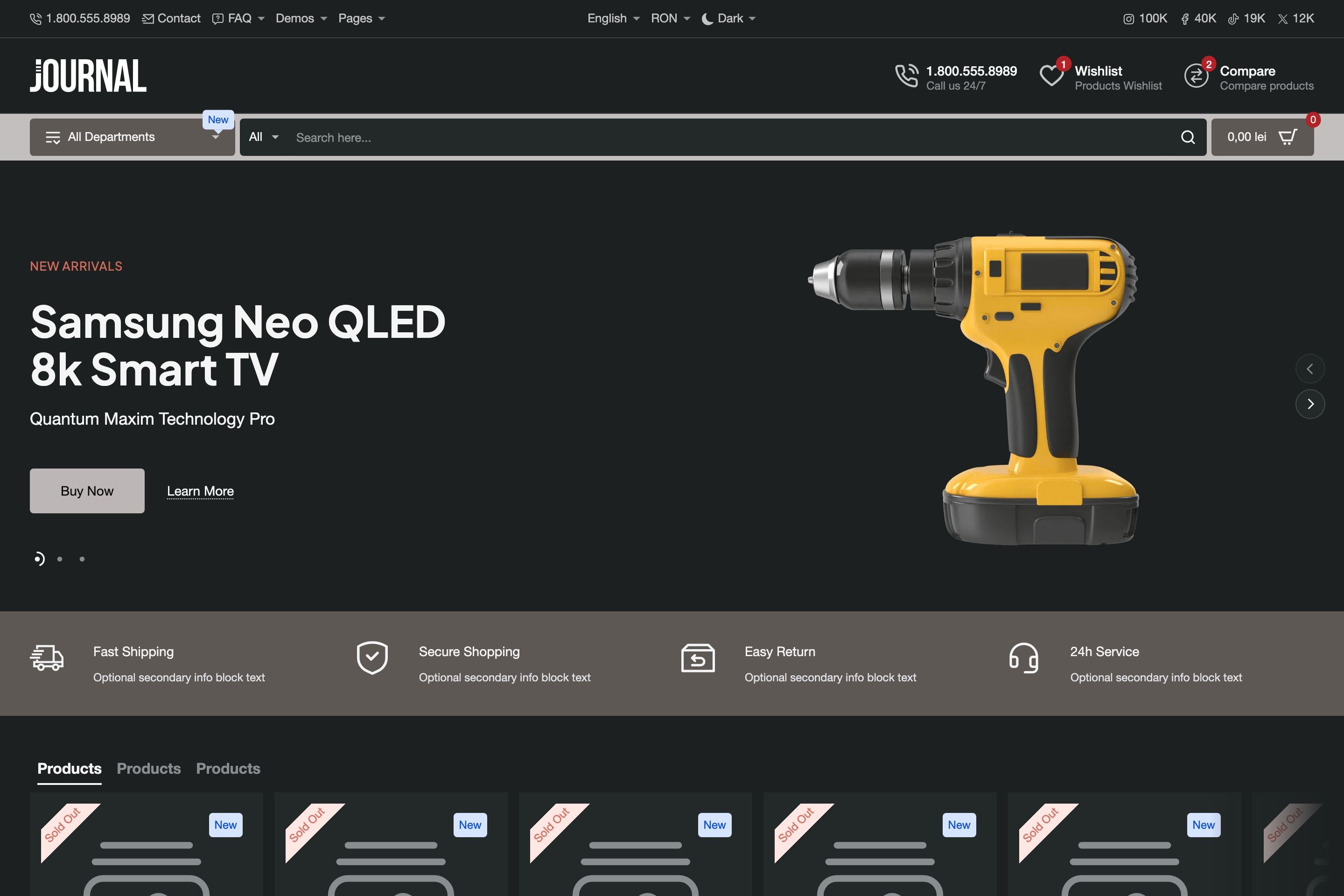
Desktop Header Blocks
Journal ships with a collection of highly customizable header blocks, including but not limited to:
- Search – Autocomplete with suggested products for faster discovery.
-
Multi-purpose links/buttons – Configurable as:
- Navigation links
- Account/Login links
- Language or Country switchers
- Light/Dark mode toggle
- Off-canvas menu trigger
- Multi-level Dropdown Menus - A category-based dropdown menu with options category image and multi-level support.
- Mega Menu – A large dropdown with a builder-style interface supporting columns and blocks such as Collections, Products, CMS Blocks, etc.
- Flyout Menu – A multi-level dropdown system supporting both simple links and mega menu structures which in turn receives blocks such as Collections, Products, CMS Blocks, etc.
All header blocks support multi-placement across sections, enabling countless variations that extend beyond the provided demo layouts.
Mobile Header
The mobile header has its own dedicated builder, featuring mobile-specific blocks. Developers can define a custom breakpoint for when the mobile header activates, ensuring a seamless transition between desktop and mobile layouts.
Additional Options
- Sticky Header – Keep navigation accessible during scrolling.
- Hero Mode – Integrate headers into hero sections for immersive layouts.
Why the Journal Header System Matters
With Journal, the header and navigation system becomes a flexible design tool instead of a constraint. Developers can:
- Prototype unique header structures quickly
- Customize navigation for different use cases (e.g., large catalogs vs. minimalist storefronts)
- Deliver truly custom client experiences without custom code or external apps
To learn more about Journal, please check out the documentation and video tutorials. If you have additional questions, please reach out in the comments on Envato Market.
Table Example
| Firstname | Lastname | Phone | |
|---|---|---|---|
| Lindsay | Walton | lindsay.walton@example.com | 123-456-7890 |
| Courtney | Henry | courtney.henry@example.com | 123-456-7890 |
| Tom | Cook | tom.cook@example.com | 123-456-7890 |
| Whitney | Francs | whitney.francis@example.com | 123-456-7890 |
| Leonard | Krasner | leonard.krasner@example.com | 123-456-7890 |
| Floyd | Miles | floyd.miles@example.com | 123-456-7890 |
Responsive Image Example

Responsive Video Example


